Designing The Check-In App
Find out how to customize the look and feel of your check-in app

Mark
Last Update 4 years ago
The design of the Attendance Checker app can be customized to your liking or to fit your brand guidelines. Find out how to personalize the success messages shown to your guests upon check-in here.
Once you are in the correct Event Workspace, click 'Solutions' in your Event Menu, followed by 'Attendance Checker'. In the Attendance Checker Control Panel, you'll see a 'Design' widget under 'Check-In Settings'. Here, you can customize your professional app with ease.
Success Message (Event Check-In)
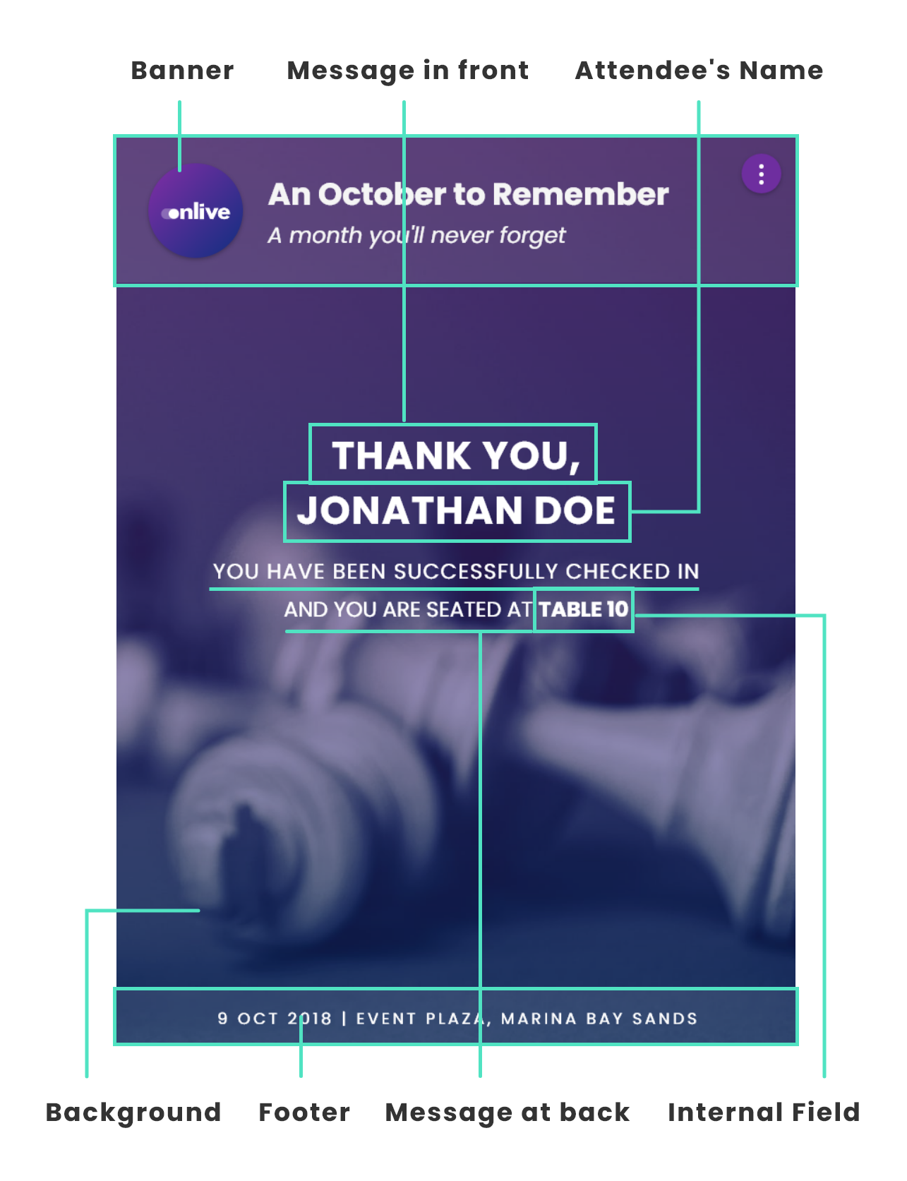
Background
You can choose to use a simple solid colour from the colour picker or to upload a background image of your choice.
- Recommended size: 2000px by 1125px
- Supported formats: jpg, png
Tip: Upload a relatively simple background image without texts on the background so that when the other elements of the kiosk go over top, it won't be hard to read!
Banner
The background needs to be plain but you can add a banner or your logo at the top to spice things up. If you are uploading a logo, you can choose for it to be left aligned or centralised in the app by toggling the switch.
- Maximum width: 768px
- Maximum height: 140px
- Supported formats: jpg, png
- Onlive's recommendation: ensure your banner does not have text in it, as this will not be responsive to differing screen sizes
Text & Button
Select a font for your texts and choose a colour for your buttons that complement your background image. Make sure that the button colour stands out!
Footer (Optional)
The footer is an image that you can use to add. It occupies a thin height at the bottom of the app.
- Maximum width: 768px
- Maximum height: 40px
- Supported formats: jpg, png